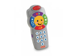
 In recent years, TV Remote control devices became more usable – except for Apple’s. Rant on. Starting with the older one (“Ridiculously symmetrical and highly unusable”) to the most recent Siri remote – where they give up on usable buttons and enable changing the channel by voice. You gotta love a company with a device so devoid of buttons – and so easily off the rails with an accidental touch. No wonder it makes more sense to talk to it. Meanwhile, many usable TV remote control devices are in the market, including an Apple TV button remote from Function101 and you can also get a button universal remote control – and even one that is back-lit – so you can see the buttons – crazy! Why are these devices called senior remotes? Duh, because they have buttons, which seniors, maybe tired of all the accidentally swiping and zooming they do with their smartphones, just seem comforting and accessible.
Next the Swedish study about automotive touch screens versus buttons – you can guess. This analysis compared the “modern, touchscreen-laden vehicles with their button-reliant predecessors. As you have undoubtedly predicted already, the older setups were the easiest to use.” But car manufacturers are like lemmings – when one converts to touchscreen, they all do. Why? Because more controls are possible via a touch screen versus a dial or button. Those who work on the touchscreen designs know that they are harder for a lone driver to manage with one hand while driving. And the buttons that remain are required by law. The Swedish test was charming – they compared 10 modern touchscreen dashboards to see how easy/fast it was to do certain tasks – changing the radio station, turning on heated seats, lowering the instrument lighting. And just for fun, they compared the time to do these tasks with the same tasks on a 2005 Volvo V70. Guess what? It was the “easiest car to understand and operate, by a large margin.”
How have user preferences been so easily ignored? Do designers actually test a design with users before scaling it up for manufacturing or releasing the new software? Apparently not, or they hand-pick the testers from their own team. Consider these 10 bad user interface designs that made it into the market. Or these 7 poorly designed products (glass stairs??). Or the not-so-smart thermostat with well-hidden controls. It’s costly to do bad design – although perhaps not in Apple’s case, since enough people bought their TV remotes to spawn a whole new line of critique and competitors. As for the TV remotes, this generation perpetuates the multi-remote storage problem on end tables that was supposed to be a thing of the past.
Why voice interfaces cover a multitude of design sins. For older adults (and everybody else) the big breakthrough in user interface design was ‘Voice First’. Seems like only yesterday that you could not speak to anything – but now through smartphones and voice-enabled remote controls, the user experience changed. We can speak to the Apple TV, the car radio, a smart watch -- and lock the front door. The differences between ‘Hey Siri’, ‘Hey Google’ or ‘Alexa’ for different devices are relatively minor compared to the power we now have. Okay, so now we headed to ‘multi-modal design.’ And a new era of complexity for the user will be born. But in the meantime, simplicity reigns. Sort of. Rant off.

 In recent years, TV Remote control devices became more usable – except for Apple’s. Rant on. Starting with the older one (“